Website Anatomy: What is the Hero Section?
 Michael
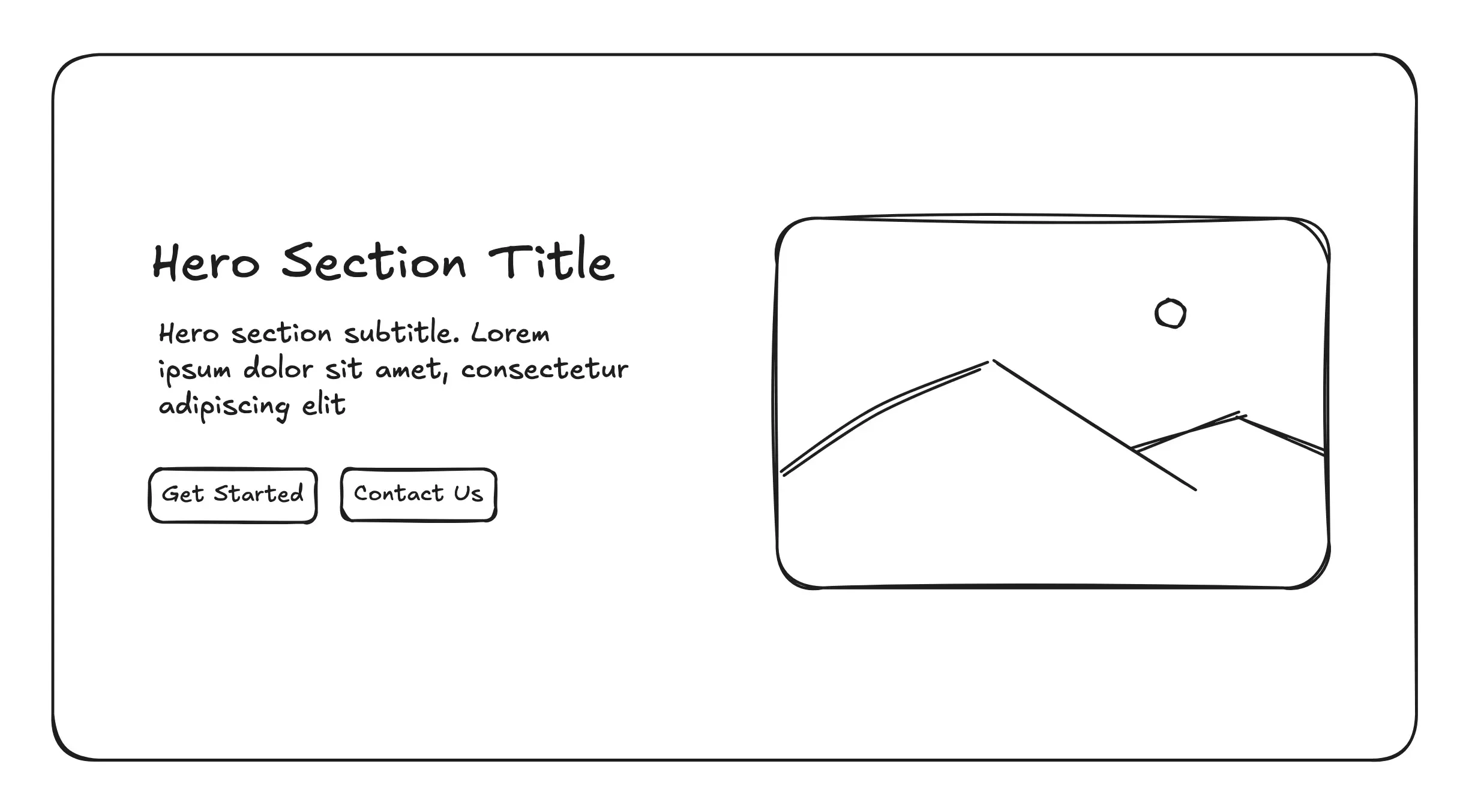
The hero section is perhaps the most important part of most modern websites. It’s the first thing visitors see when they land on your website, and it plays a pivotal role in capturing their attention, conveying your brand’s essence, and enticing them to take action. In the anatomy of modern websites, the hero section is the welcoming entryway that sets the tone for the entire user experience.
What Is a Hero Section?
A hero section is the first section you see when visiting a webpage, typically featuring a bold headline, compelling visuals, and a clear call-to-action (CTA). Its primary goal is to make an immediate impact, communicating who you are, what you offer, and why visitors should care—all within seconds. Whether it’s a stunning image, a captivating video, or a concise tagline, the hero section is designed to hook visitors and encourage them to explore further.
Why the Hero Section Matters
In today’s fast-paced digital world, attention spans are short. Studies suggest that users form an opinion about a website in as little as 0.05 seconds. A well-crafted hero section can make the difference between a visitor staying to learn more or bouncing to a competitor’s site. It’s your chance to:
- Establish Brand Identity: Showcase your brand’s personality through visuals, colors, and messaging.
- Drive Action: Guide visitors toward a specific goal, such as signing up, shopping, or contacting you.
- Build Trust: A professional, polished hero section signals credibility and reliability.
Key Elements of an Effective Hero Section
To create a hero section that resonates, focus on these essential components:
- Compelling Headline: Craft a concise, benefit-driven headline that speaks directly to your audience’s needs or desires. For example, Dropbox’s hero section uses “Work better, together” to highlight collaboration and simplicity.
- Engaging Visuals: Use high-quality images, videos, or animations that align with your brand. For instance, Airbnb’s hero section often features vibrant travel imagery to evoke wanderlust.
- Clear Call-to-Action (CTA): Include a prominent button or link, like “Get Started,” “Shop Now,” or “Learn More,” to guide visitors to the next step.
- Minimalist Design: Avoid clutter. A clean layout with ample whitespace ensures your message stands out.
- Mobile Optimization: With over 50% of web traffic coming from mobile devices, ensure your hero section looks great and loads quickly on all screens.
Conclusion
The hero section is more than just a pretty banner—it’s your website’s first handshake with the world. By combining a clear message, striking visuals, and a strong CTA, you can create a hero section that not only grabs attention but also sets the stage for a memorable user experience. As you design or refine your website, think of the hero section as your chance to make a bold first impression that invites visitors to step inside and stay awhile.